

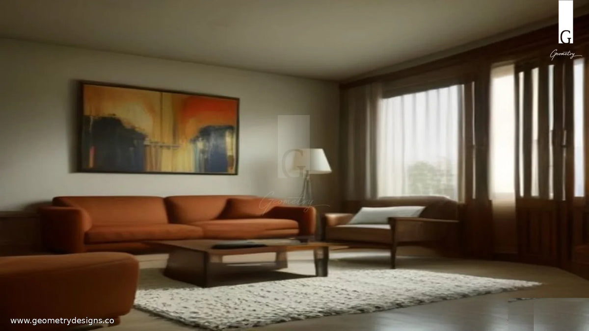
Answer: Blend art and handcrafted furniture by choosing one visual lead, protecting negative space, and repeating a few materials or tones so the room feels curated - not crowded - in an Indian luxury home.
In Geometry Designs living rooms, the most common styling mistake is not "too little personality." It is stacking personality: a statement chair, a bold canvas, a carved side table, a patterned rug, and a mirror that all want the same attention. The room becomes visually noisy even when every piece is beautiful on its own.
This guide gives a calm, practical method for balancing wall art, mirrors, and handcrafted furniture so Indian apartments and villas feel intentional, quiet, and luxurious.
What does "visual noise" look like in a luxury living room?
Visual noise is not clutter alone. It is competition. When several objects share the same visual weight - similar size, similar contrast, similar "look at me" energy - the eye never rests. Guests notice activity before they feel calm.
Typical noise patterns in Indian homes include:
- A large artwork hung above a sofa that already has a strongly patterned upholstery
- Multiple sculptural furniture silhouettes in one zone with no quiet backdrop
- High-contrast frames, metallic accents, and textured wood all fighting for the same corner
- Gallery walls that leave no breathing room next to a statement seat or console
Luxury, in Geometry's language, is selective emphasis: one clear lead, supporting pieces that finish the story, and empty space treated as a design material.
How do you choose one visual lead for art and furniture?
Decide whether the wall or the furniture owns the moment. You rarely want both to shout.
If the art leads: keep furniture quieter in pattern and silhouette. A handcrafted chair can still be exceptional through proportion, joinery, and finish - without competing through loud upholstery or oversized arms.
If the furniture leads: choose art that supports atmosphere rather than dominating it. Softer compositions, tonal abstracts, restrained photography, or a single architectural mirror often work better than a second statement piece.
A useful test: stand at the room entry and ask what you notice first in three seconds. If you cannot answer, the composition is still noisy. Edit until one answer is obvious.
How should scale and placement keep art and furniture in balance?
Scale is where most "expensive but restless" rooms fail. Art that is slightly too small above a substantial sofa looks unfinished; art that is oversized above a delicate seat feels aggressive.
- Align art width roughly to two-thirds of the furniture run below it when hanging above a sofa or console - then adjust for ceiling height and wall proportion.
- Leave clear air between the top of a seat back and the bottom of a frame so the furniture silhouette stays readable.
- In compact Indian apartments, prefer one well-scaled piece over a dense salon hang that steals wall calm.
- Keep walk paths and seating sightlines open; art should deepen the room, not block how the furniture breathes.
For mirrors, treat them as architecture: they should expand light and axis, not add another decorative layer of pattern. A quiet mirror beside a handcrafted console often feels more luxurious than a busy gallery cluster.
Which materials and tones create calm repetition?
Balance improves when art and furniture share a short material vocabulary. You do not need matching sets - you need echoes.
- Repeat wood tones between a frame, a side table, and a chair leg so the room reads as one craft language.
- Pull one quiet colour from the artwork into a cushion, ceramic, or soft accessory - not into every surface.
- Limit high-shine metals to one family in a zone (brass or chrome accents, not both competing).
- Let stone, linen, and plaster act as neutral "rest" surfaces next to richer handcrafted wood.
Geometry's handcrafted pieces already carry texture and presence. Art should either amplify that craft story gently or provide a calm counterplane - not introduce a second, unrelated material drama.
How do lighting and negative space protect the composition?
Even a perfect art-and-furniture pairing can look noisy under flat, harsh light or with no empty wall. Lighting and space are the finishing editors.
- Light the lead: a soft wash or focused glow on the primary artwork or the statement seat, not equal spotlighting on everything.
- Keep at least one wall section quieter so the eye can land after reading the composition.
- Avoid stacking lamps, tall plants, and frames in the same vertical band unless they are deliberately composing one column.
- In multi-use living rooms, protect a calm backdrop behind the main seating conversation - that is where art and furniture should collaborate, not compete with TV glare and storage overflow.
If the room still feels busy after editing objects, remove one layer of lighting accent or one patterned textile before you remove a good furniture piece. Negative space often restores luxury faster than a new purchase.
What checklist should you use before buying art or a statement piece?
- Name the visual lead for this wall or zone (art or furniture).
- Confirm the supporting piece is quieter in pattern, contrast, or silhouette.
- Check scale from the main entry sightline, not only from the sofa.
- Limit the material story to a few repeating tones.
- Verify lighting supports the lead without spotlighting every object.
- Leave intentional empty wall or floor - do not fill every gap.
- Walk the room at evening light; Indian homes often change character after sunset.
When you are ready to explore Geometry's seating, consoles, and room-making pieces, browse the Geometry Designs collection and read more practical guidance in The Geometry Journal. Related reading: How to Layer Indian Craft Without Making a Room Feel Busy, How to Style a Luxurious Living Room Without Clutter, and What a Designer Notices First in a Luxury Living Room. For a bespoke conversation about a specific room, use the contact page.
FAQ
Can a bold artwork sit above a statement chair?
Yes, if one still leads. Either soften the chair's upholstery/pattern or choose art with lower contrast so the pair shares hierarchy instead of competing.
How many artworks should a luxury living room wall hold?
Often one well-scaled piece - or a tight, intentional set - beats a crowded salon hang next to handcrafted furniture. Calm walls make craft details readable.
Do mirrors count as art when balancing furniture?
Treat architectural mirrors as spatial tools first. Use them to expand light and axis; avoid patterned mirror walls beside already sculptural furniture.
What if my furniture is already highly textured wood?
Prefer tonal or quieter art nearby, and repeat the wood language lightly in frames or adjacent surfaces rather than adding another high-contrast object.
Is this approach only for large villas?
No. Compact Indian apartments benefit even more: one clear lead and protected negative space prevent small rooms from feeling restless.


